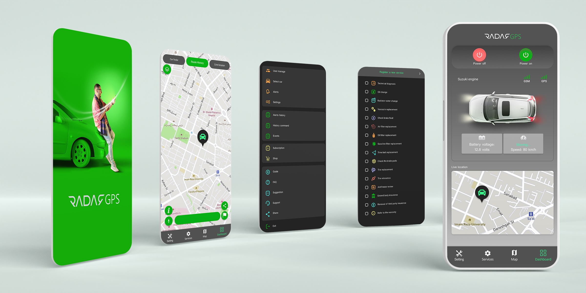
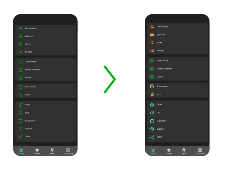
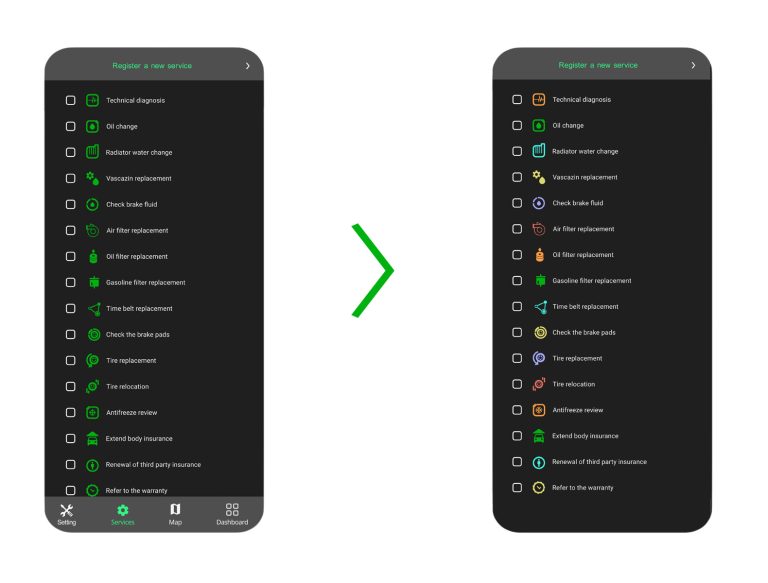
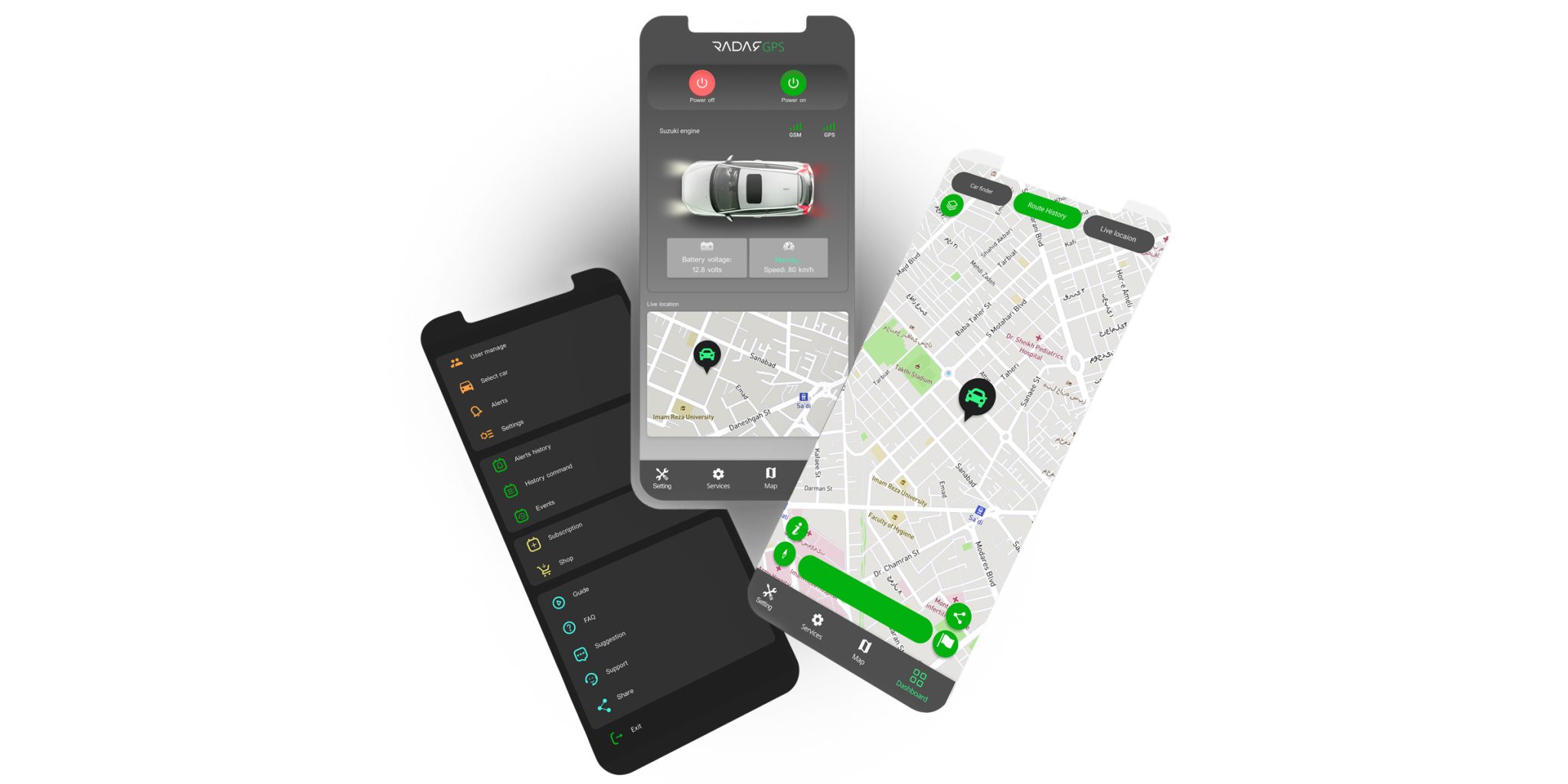
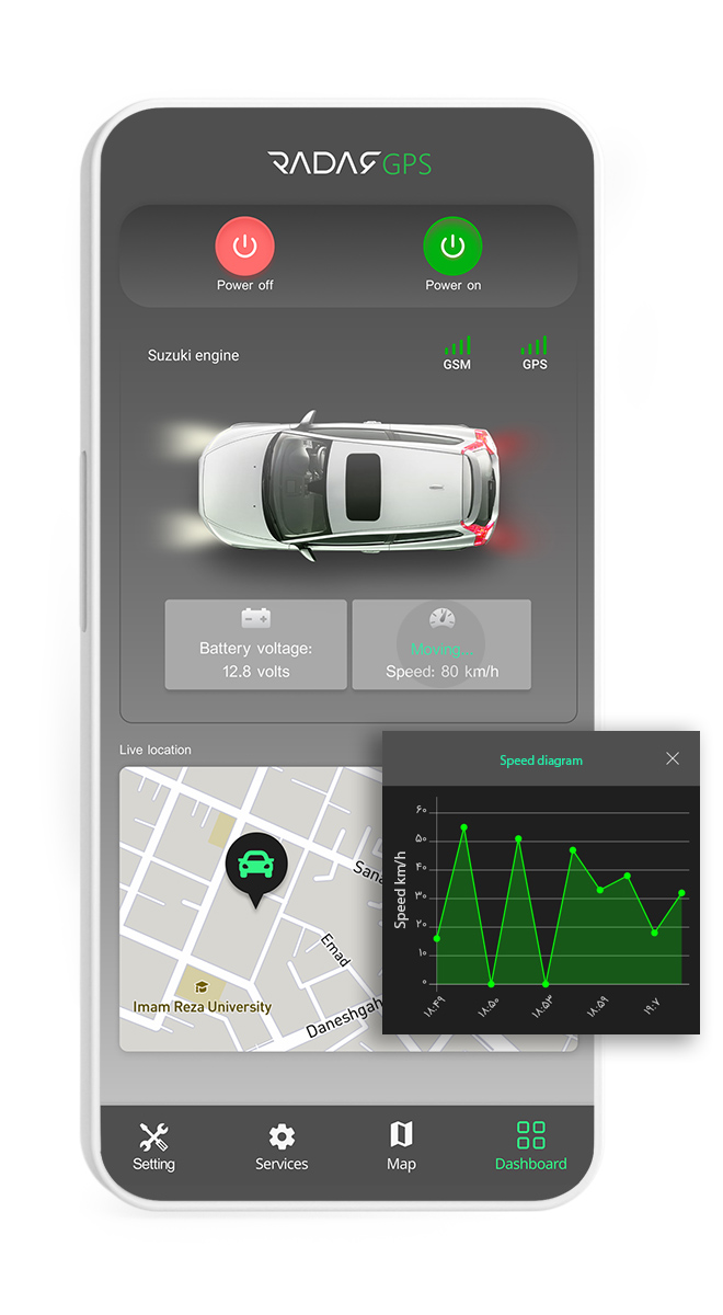
Hoda Rahimian UX

Radar Car Tracker App

Radar is a time-proven solution that helps people track their vehicles. The app allows People to capture information about distance, travel times, and whereabouts. This app also allows the vehicle owner to turn it off from a distance in case of thieves and many more options to manage and organize vehicle health.

calender

Project duration:

50 days from May 2020 - June 2020

problem

The Challenge:

- The app has not been updated since its release, and its appearance is outdated. - It isn't easy to interact with some features. - For a new design, the designer had to work very closely with the developers because they couldn't change the code everywhere in the app​ in the limited time

Goal

The Goal:

- Update the app's interface, especially the "dashboard," in a way that makes it more user-friendly and appealing.
- Work on UX writing in some areas, especially in names of the features that weren't precise.
- Working close with developers so the app can be released in the fastest time possible.
- Identify users and conduct research to identify user pain points and needs

myrole

My role:

UX Researcher, UX Designer, UI Designer, Visual Designer

Prioritization

We had a short time and should decide what was crucial for delivering new updates and what could be built further down the road. And which one the developer team could do with existing codes. So we decided to make two lists of possible features, one that must be done in our first product update and the second list that could be done in the following several updates

Competitive Analysis:

We created a competitive analysis of other vehicle tracking apps in the market. We needed to find out if there were any gaps for improvements in the existing tracking apps and trends that I could pick up, such as similarities that users can Identify. I especially wanted to pay attention to the interface of these apps because one of our primary purposes was to update and improve the visual design of the Dashboard page in the existing app. For this purpose, we create a board in Miro and upload competitors' apps and specify their strengths and weaknesses.

Feedback from marketing and customer support team

We had several meetings with the marketing and support team at Radar company. They transferred the opinions of Car tracker users and Radar customers about the app's different features. We gathered all this information and made an affinity wall to cluster other ideas.

Survey:

Recently, the marketing team had sent a questionnaire to users. So I decided to use the information obtained from the questionnaire and analyze the data to create a persona and empathy map. They had used 16 questions through an online questionnaire sent to the users via email. The following are some of the statistics obtained through this

age

User age

70% of users are between 30 and 45 years old

occupation

User occupation

50% of users are employees of a public company and employees of a private company

location

User location

60% of users live in the capital city, Tehran
30% of users live in Mashhad

Which of the app features has been most useful to you?
( up to 3 options )

How do you use the tracker when you don't have internet access?

Pain points

User can't work with off-line tracking

Users can't work with offline tracking or know how to do offline monitoring.

Users needed a complete in-app guide

The users needed a complete and easy guide about the app and annual fees.

Wrong direction of the car on the map

The direction of the car icon on the map page is sometimes different from the car's direction in the real world, which confuses users.

Persona

Ideation

Paper wireframe

Digital wireframes

Paper Prototype

Usability study: findings

Mockups

The initial version of the app codes was based on Dark Mode, and developers could not change the code during this short time. That's why I presented the final design in Dark Mode

In finalizing the prototype, we had several meetings with developers. Because there were various challenges in the software update

Colors

Primary color

Icons

What I learned:

Some essential tips in this project were precious to me. One is that working for Smart services is very different. Because the application is directly related to a piece of hardware, this connection creates other challenges. Secondly, when I start a project in the development phase, we have to have a close and permanent relationship with the developers and the technical team because many of the changes we want to make in the application after research may not be possible. When we have a time constraint, we should be able to prioritize the changes to be made.​

Next steps

Interview

I'm very excited to be able to interview users and find out how they feel about the new app and update

New features

Working on features that we couldn't update because of technical issues​

Firebase

Using "Firebase" for understanding the user behavior and uncover new insights

CRM and saleforce

We are continuing user research and exploring responses from users with the help of the CRM team and salesforce.

Continue your tour...

UX Case Studies

Graphics

Graphics