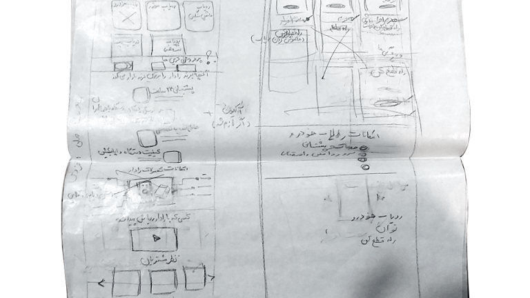
Hoda Rahimian UX

Radar Website

Radar is an online store for Radar products, including Car trackers, Motorcycle trackers, Truck trackers, and AVL Services.

The brief was to redesign the company’s website such that it incorporates rebranding and enhances the overall experience of the site.

Project duration:

45 days from June 2021 to August 2021

The Problems:

- Users were unable to find sufficient information about the products. - Users must have trust in the organization in order to purchase products online. - Because trackers are classified as smart services, users require detailed information about the product's usage and installation process.
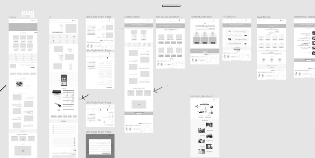
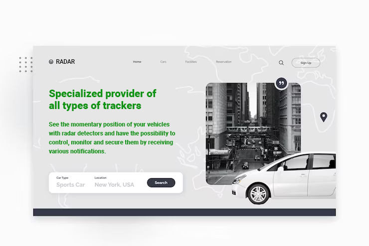
The Goal:

- Optimize web store to align with digital marketing strategies
- Add and organize information so users can easily find what they're looking for
- Improve customer retention

My role:

UX Researcher, UX Designer, Visual Designer, Art director

Responsibilities:

Research, Design, and art direction for photography and illustrations

User research

To research this project, we used qualitative methods like the interview and analysis of Google Analytics.

Interview

Goals

  • We want to understand how users feel about the shopping process
  • We want to know the behavior and experience of users regarding the shopping process on the site.
  • We want to know about user problems and needs while using the website google.

Interviewees

We choose interviewees based on 3 factors with the help of google analytic:

  • Users who shop online in radargps.org
  • Users who enter the website and did not shop online
  • Users who go back to the website and shop


Procedure

We interviewed 8 people with Google zoom, recorded the session, and took notes. Then we typed the interview word by word and made an empathy map based on each interview.

pain points

Pain points

The users need to find clear, precise and direct information about the product in the website easily

Pain point

Users need to know the differences between Radar trackers and similar products in the market.

Pain point

Users need to feel trusted and easeat in the online shopping process

Pain point

Users need to have a safe and easy payment process in online shopping, annual charges, and charging sim cards.

Google analytic findings

Users time of shopping

  • We want to understand how users feel about the shopping process
  • We want to know the behavior and experience of users regarding the shopping process on the site.
  • We want to know about user problems and needs while using the website

Blog entrance

There was considerable traffic on the blog page, and the marketing team was looking for a way to guide the users into product pages. As UX designers, we wanted to help them achieve their goals without user frustration.

Users device

We noticed that most of the users on the radargps website are with android phones, so we chose to design based on the phone screen.

Persona

Mr. Ali Amiri is a private company employee who needs to buy a car tracker online when at home because he can save time and skip the traffic.

User journey map

Ali Amiri is a private company employee who needs to obtain information and buy a car tracker online because he can save time and energy.

Competitive Audit

Objective

Sales of tracker products on the website were less than in other sale channels, and in general, sales of this product from any brand in Iran were too low on the Internet. The competitors are selling their products mainly in the physical marketplace, and we wanted to know why and how we could help users so they could shop this product online.

Research questions

Are the competitors investing in their website?

How do foreign competitors present their products on their websites?

What are competitors’ weaknesses and strengths?

Procedure

We reviewed these aspects of each competitors website: 

  • Products offering
  • Unique value proposition
  • First impressions
  • Interactions
  • Visual design
  • Content

Insights

We found that most domestic competitors did not invest in their website and did not sell online, and the website usually referred users for phone advice. By placing accurate, precise, and complete information, we could fill this gap in the market, also, most of the competitors did not have a specific brand and visual design. There was also a cold and industrial atmosphere on their websites that we decided to use the proper branding. Use real photos while showing users using the tracker in real daily life, to fill this space.

Ideation

We made a list of all problems that needed ideation and conducted several brainstorming sessions with participants from different teams like marketing and SEO.
Another method we used for ideation was crazy eights for website layout and structure.

Digital wireframes

We had a few things in mind in designing the wireframe: responsiveness and the content hierarchy. After completing the wireframe, we presented it to the developers and the marketing team in several sessions and iterated in our design.

Usability study

To test usability, we considered two essential points: participants can easily find the information they need and the purchase process.

Mockups

Home page slider

We decided to use photos on the website that show the use of the trackers in real life and convey a positive feeling to the user with bright and warm colors.

Takeaways

What I learned:

In online shopping, trust is a significant factor. Users need to trust the website to buy the product. We consider information and sections to gain user trust. Providing comprehensive and complete information about the product is essential. How the website will be built regarding code writing or using WordPress is crucial as this will indirectly affect the design process. Announcing the website's new interface should be at least one month after release so we can resolve all possible problems. After the initial release, the team was in an alert mode that if any bog or problem occurred, they could fix it immediately.​

Next steps

Hotjar

Set Hotjar and constantly check the customer behavior and performance on the website.

KPI

Set KPI in some pages with google analytic and measure the site's performance by user time on task, user error rate, and drop-off rate. Also, we will send a questionnaire after a month from site new updates to measure the rate of user satisfaction.​

Interview and Usability test

We will have usability testing, especially on parts with the highest error and drop-off rate. Interview with current and potential customers to improve the products.

SUS

Measuring system usability scale by making the SUS questionnaire and sending it to customers and website users.

Continue your tour...

UX Case Studies

Graphics